- Services
- Industries
whoweare" class="tab-landing" style="width:100%;">Who We Are
Boilerplate Intros
Full Length
Engineering Impact
GlobalLogic, a Hitachi company, is a trusted digital engineering partner to the world’s largest and most forward-thinking companies. Since 2000, we’ve been at the forefront of the digital revolution—helping create some of the most innovative and widely used digital products and experiences. Today we continue to collaborate with clients in transforming businesses and redefining industries through intelligent products, platforms, and services.
Short Length
GlobalLogic, a Hitachi company, is a trusted digital engineering partner to the world’s largest and most forward-thinking companies. We’re known for engineering impact with intelligent products, platforms, and services that transform businesses and redefine industries.
Micro Length, Version A
GlobalLogic, a Hitachi company, is engineering impact through intelligent products, platforms, and services.
Micro Length, Version B
GlobalLogic: Engineering impact
through intelligent products,
platforms, and services.Logos
Wordmark
The GlobalLogic wordmark is the main symbol we use to represent the brand. It embodies our business and the values that we stand for. It’s vital that it is used with care and respect to ensure that all content remains distinct and memorable. It is primarily used in our White and Steel Gray 100 color options to allow for maximum contrast and readability.

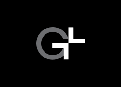
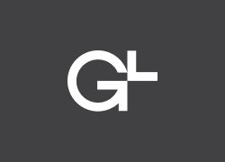
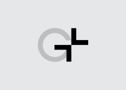
Symbol
Another mark used to represent the GlobalLogic brand is the symbol. This represents everything the wordmark does but in a condensed form.
Clear Space – For the symbol, the minimum clear space is defined as the height of the arrow-shaped element in the “G” letterform.
Color Usage – The symbol should always be displayed in Steel Gray 50 and used in a similar way to a watermark. With the exception of the favicon which must be shown in Steel Gray 100 on an Impact Orange background.

Color Palette
GlobalLogic’s primary brand colors are Black, White, Orange, and Light Grey. These colors can and should be used most prominently throughout brand-related materials and designs. Our secondary brand colors include an array of neutrals (shades of grey), as well as five rich accent colors (Light Orange, Blue, Lime, Canary, and Teal). The secondary accent colors should never be used together, but rather individually paired with the neutral colors or in some cases the primary Orange color.
The values that should be used for print applications are the CMYK and Pantone (PMS) values. For digital applications, the RGB or HEX values should be utilized.
White

White
RGB 255 255 255
HEX #FFFFFFLight Steel

Light Steel
RGB 242 243 246
HEX #F2F3F6
Steel Gray 25
RGB 200 202 211
HEX #C8CAD3
Steel Gray 50
RGB 133 138 155
HEX #858A9B
Steel Gray 75
RGB 72 79 107
HEX #484F6B
Steel Gray 100
RGB 24 26 36
HEX #181A24Impact Orange

Impact Orange
RGB 255 95 45
HEX #FF5F2D
Light Orange
RGB 255 206 185
HEX #FFCEB9
Deep Orange
RGB 207 55 08
HEX #CF3708Impact Blue

Impact Blue
RGB 68 66 227
HEX #4442E3
Light Blue
RGB 213 212 255
HEX #D5D4FF
Deep Blue
RGB 00 01 139
HEX #00018BCyan

Cyan
RGB 129 202 255
HEX #81CAFF
Light Cyan
RGB 172 221 255
HEX #ACDDFFYellow

Yellow
RGB 230 235 93
HEX #E6EB5D
Light Yellow
RGB 252 255 179
HEX #ACDDFFGreen

Green
RGB 46 119 106
HEX #2E776A
Light Green
RGB 145 196 187
HEX #91C4BBBrand Elements
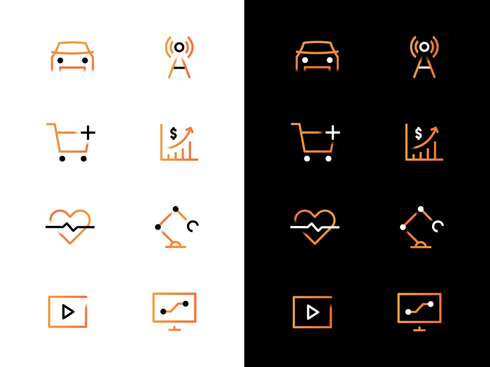
Iconography
GlobalLogic has developed a unique and dynamic icon style that complements our brand’s visual aesthetic. Our icons can be used over light or dark backgrounds, and are the only brand elements where gradients can be utilized.
Imagery Style
Our imagery style is intended to be genuine, people-forward, and technology-centric. It should organically tell our story in a way that represents our global team and our hands-on approach. The imagery must feel human, as it is often responsible for turning abstract concepts or services into relatable visuals.

Imagery Treatment
When using imagery for large or full-bleed applications, particularly with content overlaid on top, a grayscale effect must be applied. Additionally, areas of an image where content will be placed should be darkened (using a Black gradient) to provide sufficient contrast and ensure legibility.

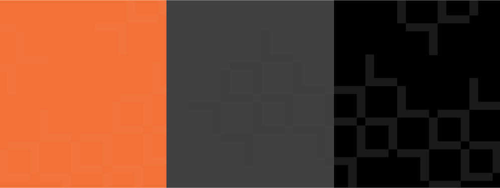
Patterns
Our pattern is a subtle and abstract visual element that should be used minimally and selectively. Inspired by GlobalLogic’s symbol, this pattern is intended to be versatile and morph based on a composition—so long as it visually maintains an aligned, grid-like appearance as a whole.
 logos" class="tab-landing" style="width:100%;">colorpalette" class="tab-landing" style="width:100%;">brandelements" class="tab-landing" style="width:100%;">brandguidelines(pdf)" class="tab-landing" style="width:100%;">
 - Industries